Blue Poppy
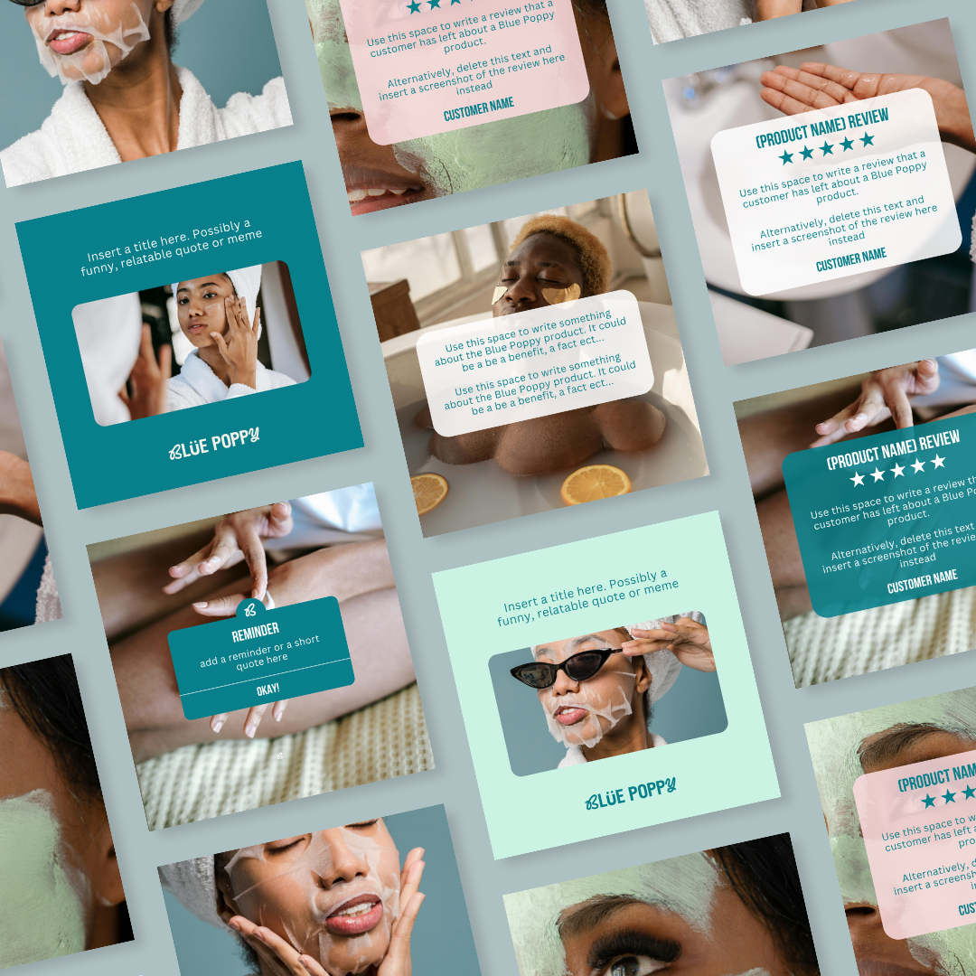
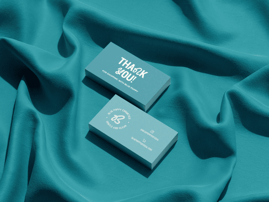
Blue Poppy is a skincare brand founded by two sisters on a mission to make skincare feel simple. This identity was designed to be bold but clean, promoting self-care while avoiding overwhelm.
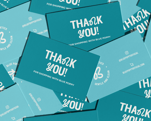


We used a combination font with a playful Y and B to reflect the shopping experience: fun from beginning to end.
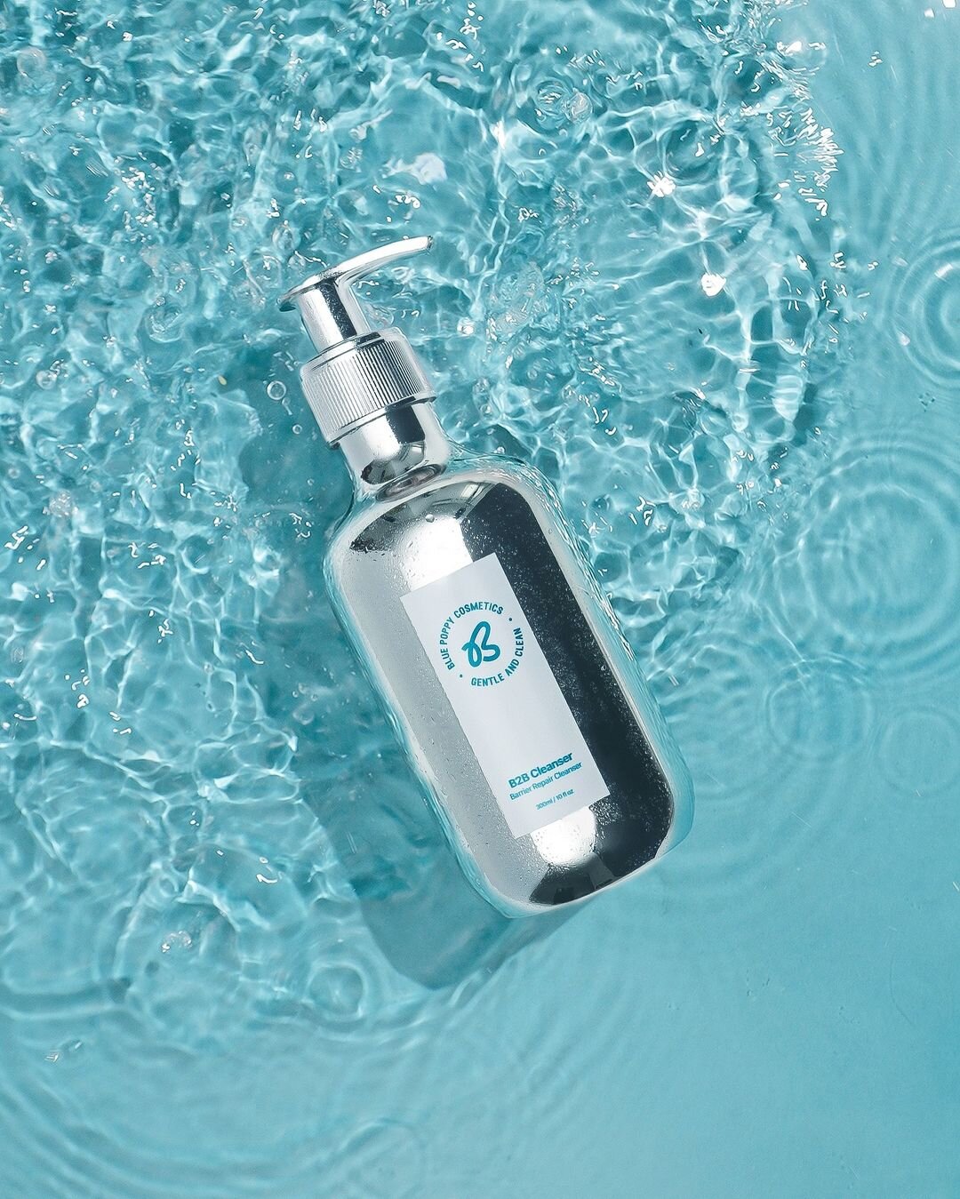
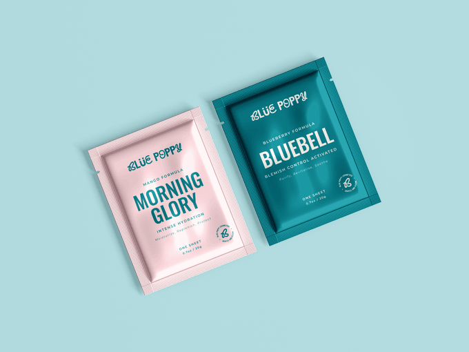
We carried over the umlaut for brand recognition and a B that subtly nods to a butterfly; both a callback to the original brand.
Clean layouts were used to reduce consumer overwhelm, helping the brand feel simple and confident in a saturated space.
the brain behind the brand identity


")


BLUE POPPY TEAM
"We have really enjoyed working with Robin. We appreciated the seamless experience. We felt heard and we can tell that Robin really put her heart into our project. She translated our brand values and mission really well and she was a great communicator. We can't wait to work with her again."
